Halloween is more than just a night of spooks; it’s a season of creativity. Whether you’re a professional designer or someone looking to add some festive flair to your projects, there’s no better time than Halloween to let your imagination run wild. In this blog post, we will explore graphic design tips that will make your Halloween visuals truly standout.
- Why Halloween Graphic Design Matters
- Utilize Festive Color Schemes
- Incorporate Iconic Imagery
- Play With Typography
- Embrace Texture and Layering
- Don’t Forget the Call-to-Action
- Real-Life Applications: Big Brands and Halloween Campaigns
- Final Thoughts on Halloween Graphic Design
Why Halloween Graphic Design Matters
If you’re running a Halloween campaign, whether for a business or just a personal project, good graphic design can make all the difference. It can attract more eyeballs, create a memorable impression, and elevate the overall aesthetic of your promotional materials. Let’s dive into some graphic design tips that can enhance your Halloween projects.
Utilize Festive Color Schemes
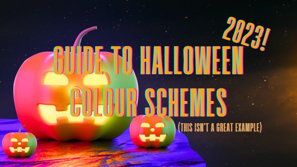
When it comes to Halloween, the color palette isn’t just an afterthought—it’s a central player that sets the tone for your entire design. Picking the right colors can create an atmosphere, evoke emotions, and instantly convey the holiday spirit. So let’s break down the key colors often associated with Halloween and discuss how to incorporate them into your graphic design projects for maximum impact.
Orange: The Quintessential Halloween Color
Orange is undoubtedly the most recognizable color when we think of Halloween. It represents warmth, enthusiasm, and is closely associated with autumn and pumpkin patches. Use orange in:
- Headers and Titles: This will make them pop against darker backgrounds.
- Buttons and Call-to-Action Elements: A bright orange can command attention and encourage clicks.
- Highlights and Accents: Use it sparingly to highlight important aspects of your design.
Black: The Backbone of Halloween Aesthetics
Black is the go-to color for creating contrast and depth in your Halloween designs. It’s associated with mystery, the night, and of course, spookiness. Use black for:
- Backgrounds: It makes brighter colors stand out and gives your design a haunting feel.
- Text: Black text on a lighter background is easier to read and maintains a professional tone.
- Borders and Outlines: Black can help define spaces and make your elements pop.
Purple: The Color of Mystery and Magic
Purple combines the calm stability of blue and the fierce energy of red to bring a sense of mystery and luxury. It’s also a color that complements both orange and black. Use purple for:
- Background Gradients: A subtle gradient can give your design a contemporary look.
- Text Highlights: Use it for subheadings or keywords to break up monotonous text.
- Icons and Imagery: Purple can bring a different flavor to traditional Halloween symbols like witches, potions, or mystical moons.
Lime Green: The Accent of the Unnatural
Lime green is not a traditional autumnal color, which is exactly why it works so well for Halloween—it stands out as the color of the supernatural and the eerie. Use lime green for:
- Accents: A little goes a long way, so use it to highlight small elements or features.
- Text Boxes or Bubbles: This color grabs attention and can be perfect for quotes or important messages.
- Contrast: Lime green contrasts well with both black and purple, making it a versatile choice for various design elements.
Mixing and Matching for a Festive Feel
Don’t feel confined to using just one of these colors. A mix can add complexity and richness to your designs. For example:
- Orange and Black: A classic duo that provides high contrast and readability.
- Purple and Lime Green: This pair can make your design feel playful and dynamic.
- All Four: In moderation, using all four can create a vibrant, eye-catching composition.
By thoughtfully incorporating these Halloween-centric colors into your graphic design, you can evoke the holiday’s magic, mystery, and yes, even its mischief, making your projects truly standout.
Incorporate Iconic Imagery
No Halloween design is complete without the inclusion of some iconic imagery like pumpkins, bats, witches, and skeletons. These images not only scream Halloween but also make your designs instantly recognizable.
Play With Typography
The right font can set the mood for your Halloween-themed designs. Fonts like “Creepster”, “Nosifer”, and “Pumpkin Story” can add a creepy, whimsical touch to your text.
Embrace Texture and Layering
Adding texture to your designs can make them more dynamic. For Halloween, consider textures that mimic natural elements like wood, fog, or spiderwebs.
Don’t Forget the Call-to-Action
If your design is for a campaign or promotional material, a compelling call-to-action (CTA) is crucial. Make your CTA pop by using contrasting colors and a font that’s easy to read.
Real-Life Applications: Big Brands and Halloween Campaigns
Wondering how top brands leverage Halloween in their graphic design strategies? Here are some memorable examples:
- Chipotle’s Boorito Campaign: Chipotle’s annual “Boorito” campaign uses Halloween-themed graphics featuring spooky burritos and hauntingly good deals to entice customers into stores. They typically use dark backgrounds with bold, orange text to make their promotions pop.
- Fanta’s Spookfest: Fanta goes all out with their Halloween designs featuring vampires, witches, and, of course, their iconic orange soda. The brand uses its recognizable orange color but adds creepy elements to make it Halloween-appropriate.
- Target’s #HalloweenHills: Target’s social media campaign uses Halloween-themed graphics featuring animated characters and spooky landscapes. The brand skillfully employs a mix of colors, icons, and fonts that stay true to their brand while celebrating the holiday.
These examples illustrate how integrating Halloween elements into your graphic design can be both fun and effective for driving engagement.
Final Thoughts on Halloween Graphic Design
By applying these graphic design tips, you’re well on your way to creating designs that not only captivate your audience but also perfectly embody the Halloween spirit. So, break out your design tools and let your creativity take flight—after all, ’tis the season to be spooky!